Teresa Jolley shares the experience of her first ‘hack weekend’ creating an interactive map for tweeting your MP on High Speed 2 (HS2).
As part of the HS2 team winning the Crowd Category award at The Times Build The News weekend in February 2014, we proved that with a nose for a story, some basic data skills and good teamwork it’s possible to build and publish something valuable within two days.
Using journalism and data to engage the public
The controversy and confusion surrounding HS2 gives a great basis for journalistic content, but rather than just report the stories, we wanted to help people understand the issues locally and feel empowered to take part in the conversation.
Determined to deliver something tangible and useful, we spent the first couple of hours deciding what was feasible to create in the timescales and with our combined skillsets.
The purpose of the weekend was to see what new types of journalism was possible when journalists and coders worked together, but several teams including ours didn’t include a coder. Undeterred, we set out to prove that our combined experience of using Google maps, fusion tables, scraping websites for content, and data cleansing skills using nothing more that googledocs or microsoft excel would not hinder us competing with those teams who did have a coder or two in their midst.
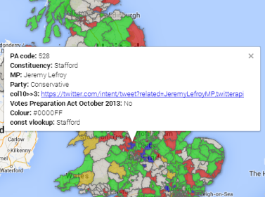
Having settled on building an interactive map of UK constituencies with links to each MP’s twitter account, we set to work.
You don’t need to write code to publish useful things
First, we needed the names of all the MP’s, which constituency they represent, how they voted in the HS2 Preparation Act in October 2013, and their Twitter account. We found a list of MP’s and how they voted here, and a list of MP’s Twitter Accounts via Tweet Minster.
To make the map work though, we needed a single list of all MP’s, how they voted, and their Twitter account, so I was charged with finding a way to pull the data from these different sources together so we could create our map.
The best way to do this is to find a unique field that exists in every different dataset you have, like a code. As is usually the case when working with data straight from the web (rather than from a structured database), often you don’t find the same code in every dataset you have. That’s life, so you have to get creative!
The worst way to do this is to go through every single row in each dataset and enter data from one sheet to the other manually, firstly because it takes too long and secondly it is very prone to errors.
The most practical approach is find a field common to both datasets (say the MP name), then use this to order the data in the same way in both datasets, enabling you to copy and paste the codes from one to the other. There are frustrations to overcome with this approach, such as the MP names being in one combined field in one dataset, and split into first and second names in the other datasets. But with a little patience and some friends on hand with practical knowledge of excel you can resolve it.
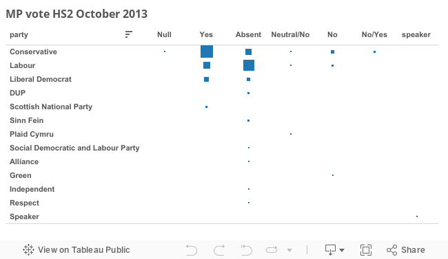
We published the map to a website using Weebly, and also managed to squeeze in a quick summary of how MP’s voted, visualising this data using Tableau Public (this takes seconds once the data is ready):
The Results?
We created a valuable resource of MP’s, their Constituencies, Twitter Accounts and how they voted for the HS2 Preparation Act – something which didn’t exist before.
Although the map is not finished, it is a great basis for development, something unlikely to have been created without the focused effort generated by a defined, time-bound challenge.